CA Spotnik Serif — Serif Without Old Habits
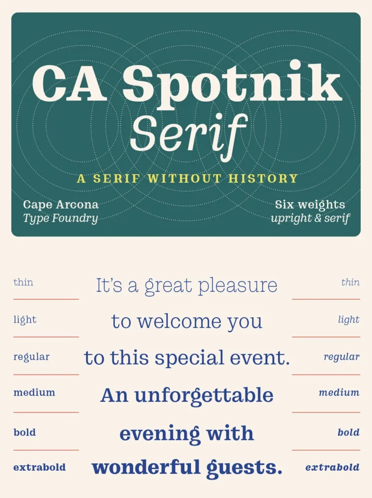
CA Spotnik Serif is a serif typeface that does not draw directly from historical models. Its lack of traditional vertical serifs gives the design a cleaner, more current look, while still leaving room for subtle traces of Scotch Serif influence. The Italic variant shows this most clearly, bringing a measured mix of classic elegance and contemporary character.
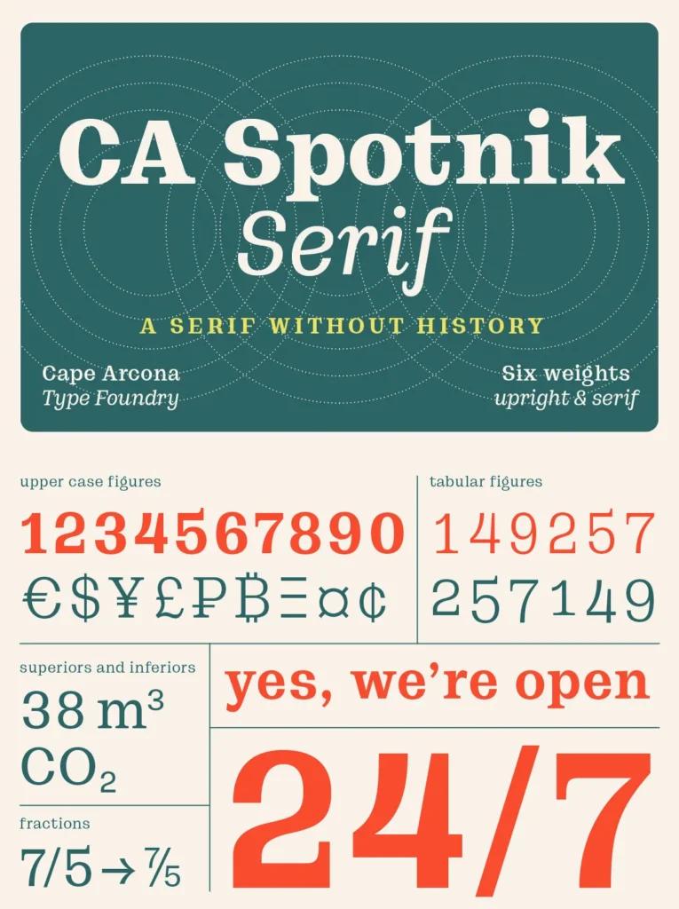
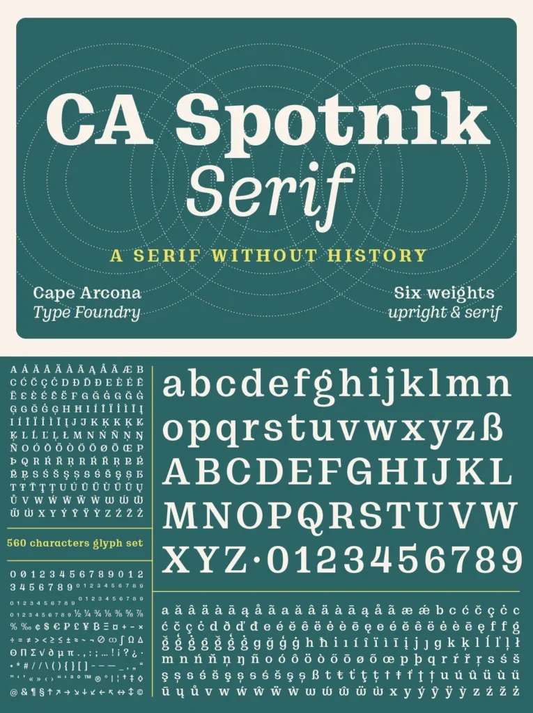
The font includes various stylistic alternates, giving designers room to adapt the design for different typographic needs. OpenType features such as arrows, superior and inferior numbers, fractions, and more add practical flexibility across editorial, branding, and digital design applications.
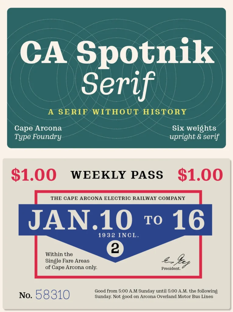
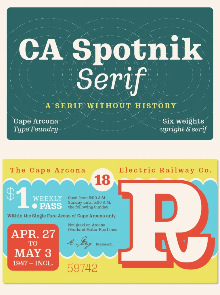
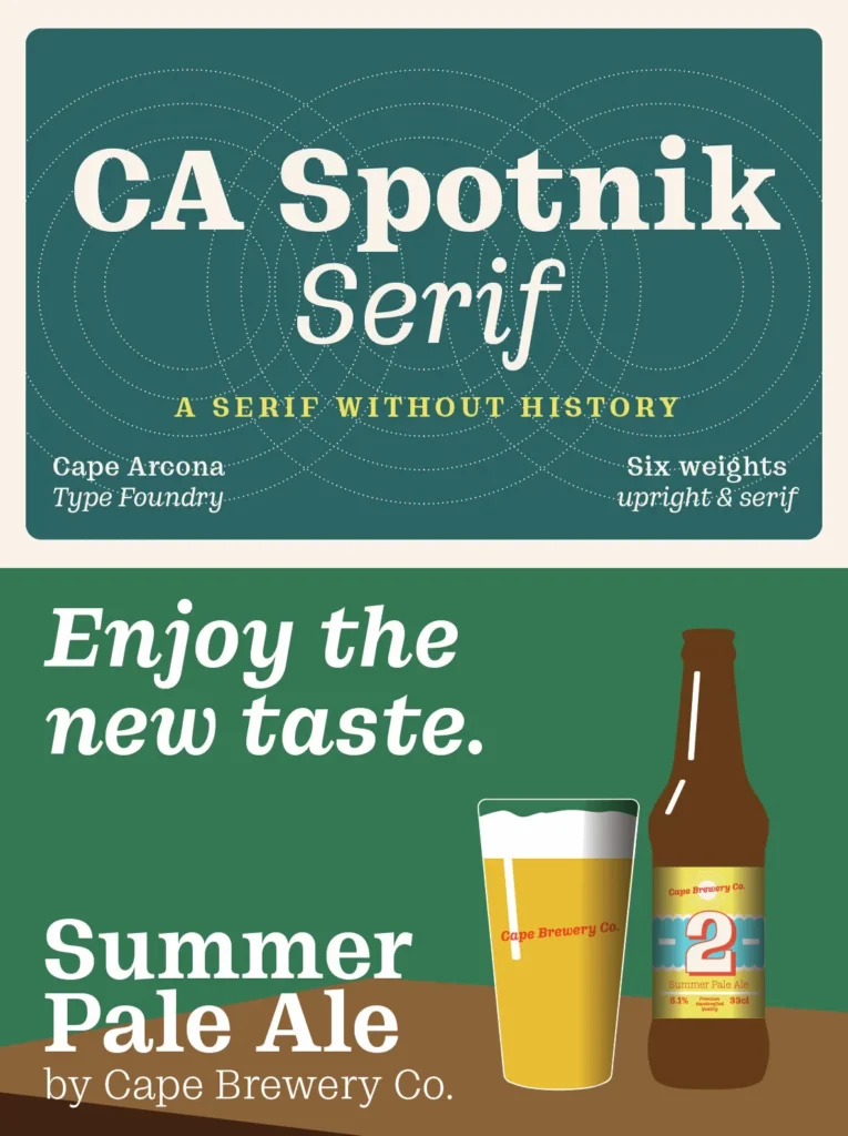
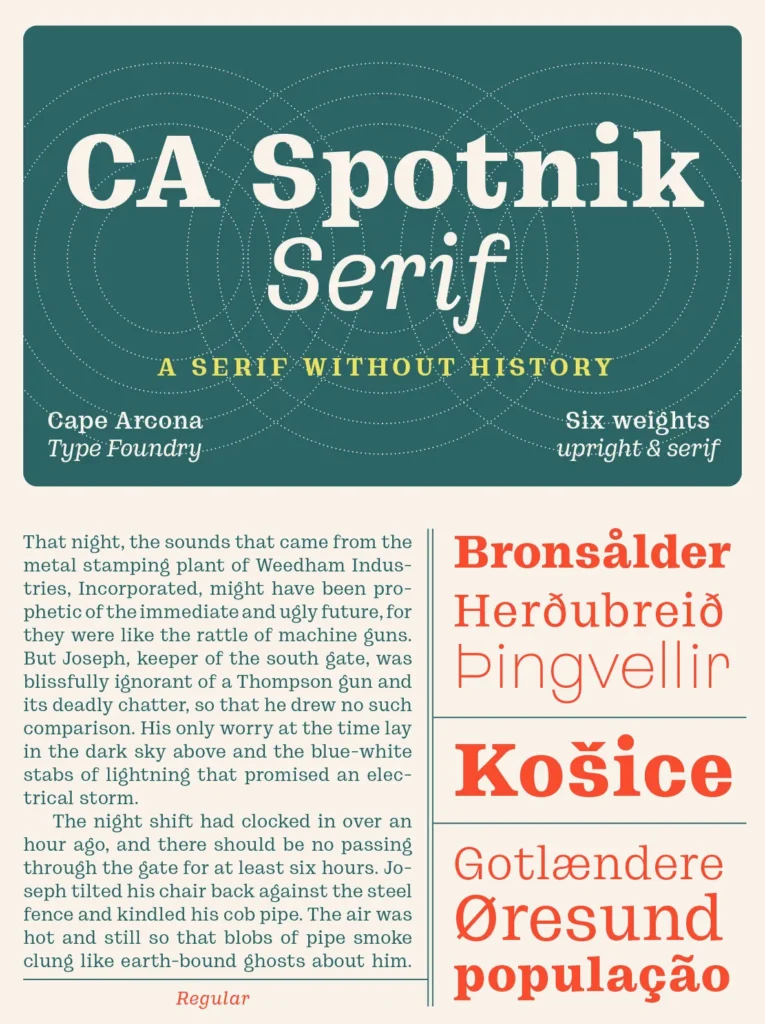
As its name suggests, CA Spotnik Serif belongs to the CA Spotnik family. It shares some similarities with the Grotesque version, but its narrower design supports readability and makes it a strong choice for body text. At first glance, it may recall well-known typefaces such as Clarendon or Ionic, yet at larger sizes the quieter differences become clear, revealing CA Spotnik Serif’s distinct modern character.