Discoblur — Distress With Discipline
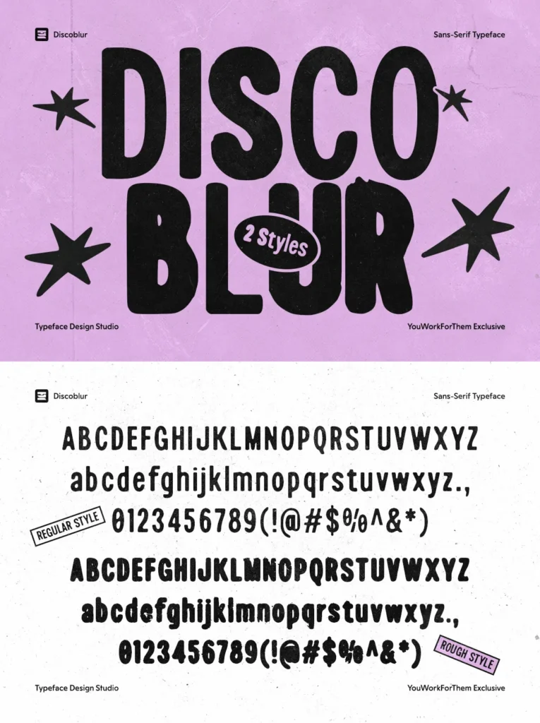
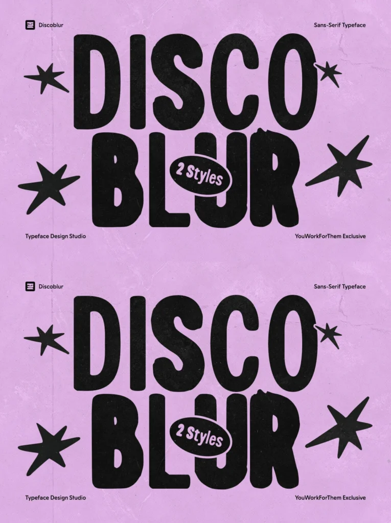
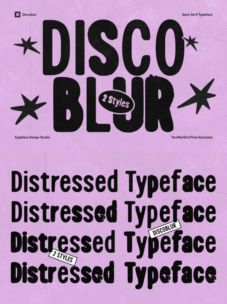
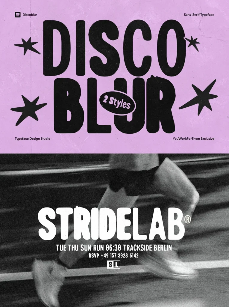
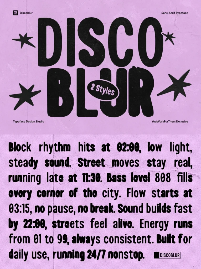
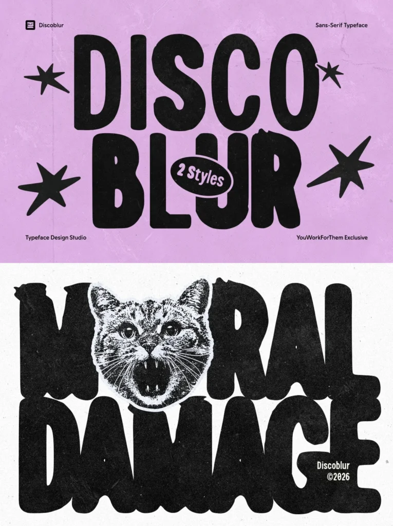
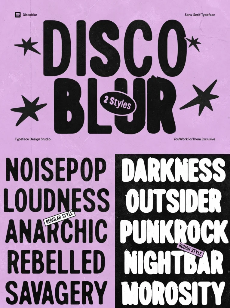
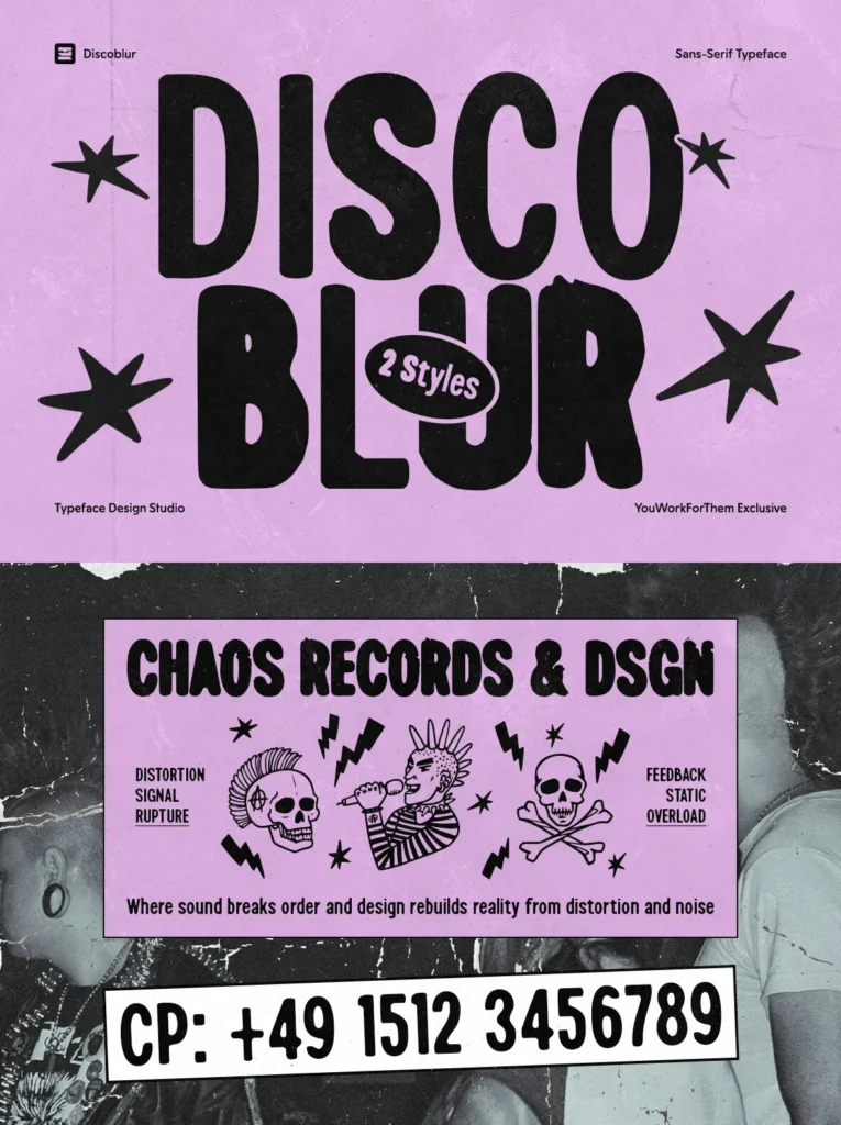
Discoblur is a heavy distressed sans-serif built for the modern workflow. Designed by Typeface Design Studio as a YouWorkForThem exclusive, it gives designers a bold display font with two distinct textures. Regular carries a clean ink-bleed quality at body and mid-sizes, while Rough delivers heavy surface distress at display scale.
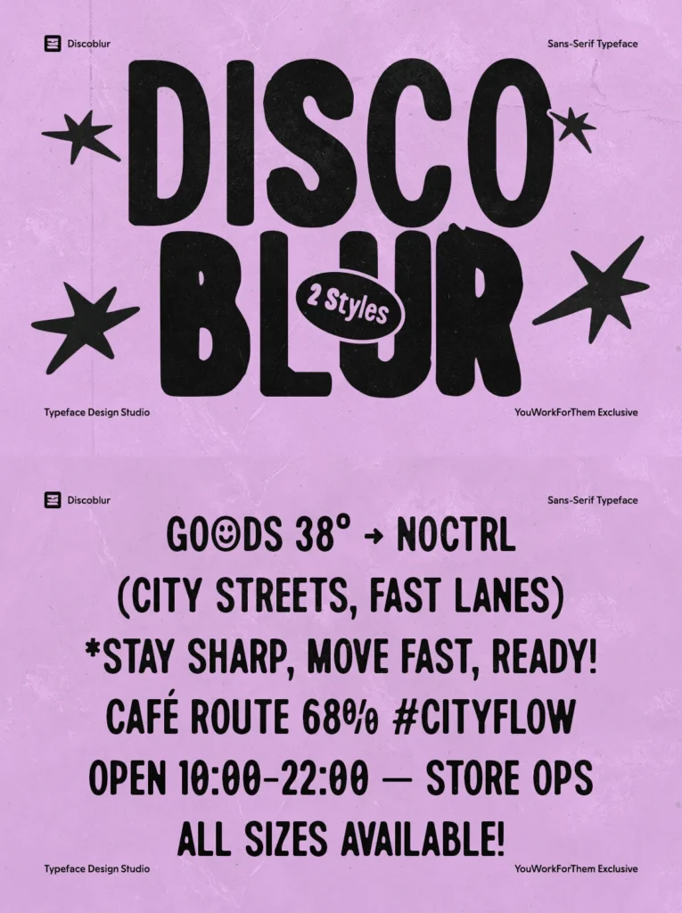
The family brings a level of control not typically found in distressed typefaces. One style feels contained and usable for supporting text; the other brings a raw, worn presence for headlines, logos, and large-format typography. Both share consistent proportions and careful typographic drawing, giving Discoblur practical range across branding, posters, merchandise, digital content, and interface work.
Designed for Today, Not the Nineties
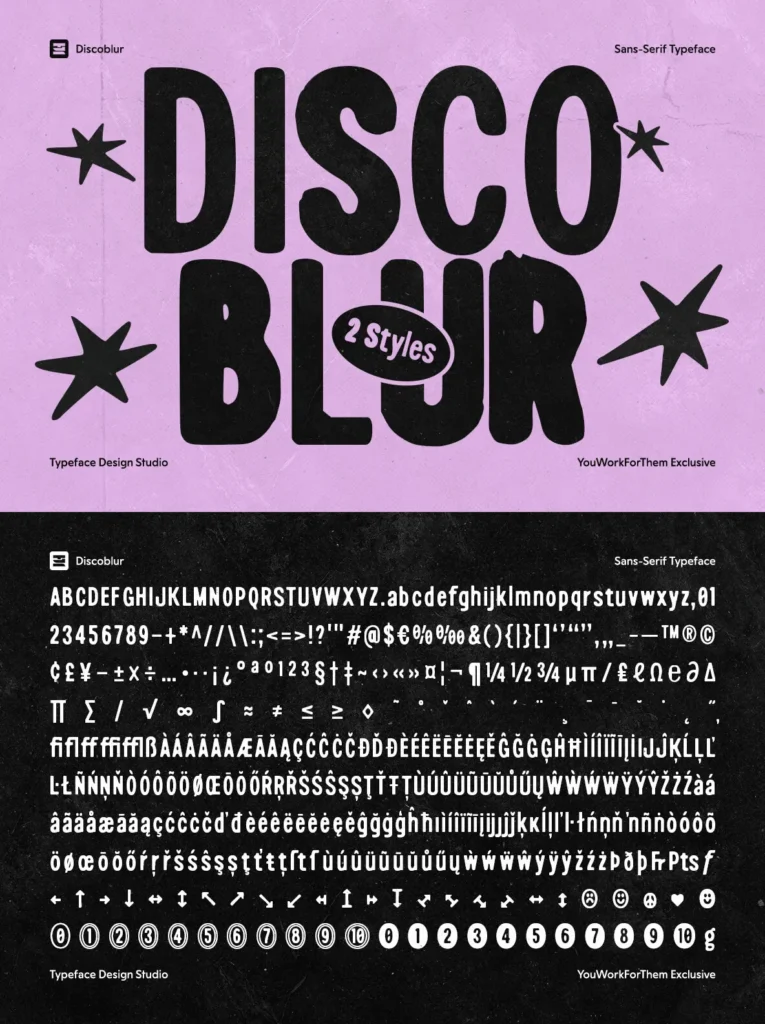
Many grunge fonts from the nineties were built with minimal technical depth, low glyph counts, no language support, and no OpenType features. Discoblur addresses those limits with 446 glyphs, broad language coverage across Latin and Greek-based sets, and nine OpenType features.
Styles / Glyphs
Regular
Rough
446 glyphs
Use Cases
Punk and independent music branding
Sports and streetwear labels looking for an edgy headline weight
Event posters
Merch graphics
Social media content
App UI where personality at large sizes matters
Secondary text, especially with the Regular style at smaller scales
Titles, logos, and any scenario that benefits from a worn, high-contrast typographic presence, especially with the Rough style
OpenType Features
Alternates, Fractions, Standard Ligatures, Stylistic Alternates