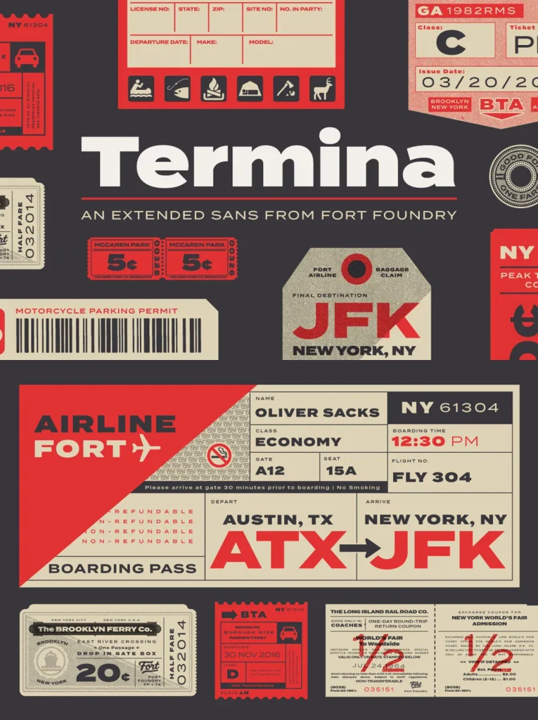
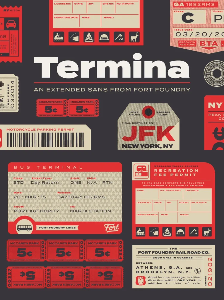
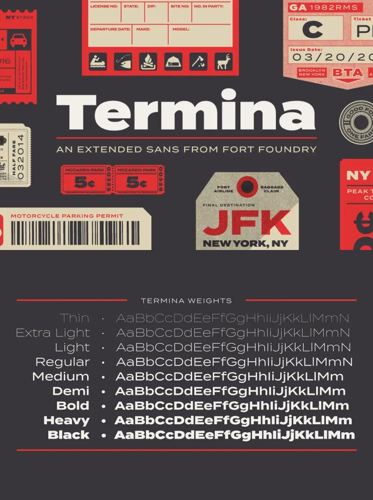
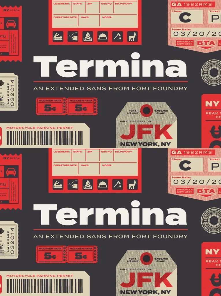
Termina — Wide Geometry, Plainspoken Force
Amongst the landscape of geometrics, Termina breaks the norm with generously wide letterforms. The typeface began with research into historical specimens for Industria, a family designed by Hermann Zehnpfundt in the early nineteen-hundreds for Emil Gursch. The strength of those extended shapes at larger sizes—and their simplicity at smaller sizes—set the direction.
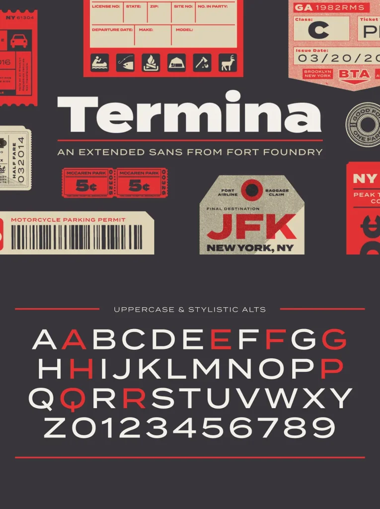
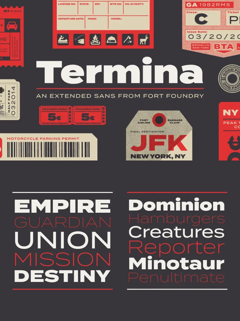
Termina is no Industria revival or clone; it is a modern take on this wide geometric, grotesque style. Use it for advertising and logotype, from small descriptors to pull quotes. A high x-height and wide proportions help retain legibility and readability at smaller sizes. Clocking in at 743 glyphs, Termina includes a wide array of features and language support.
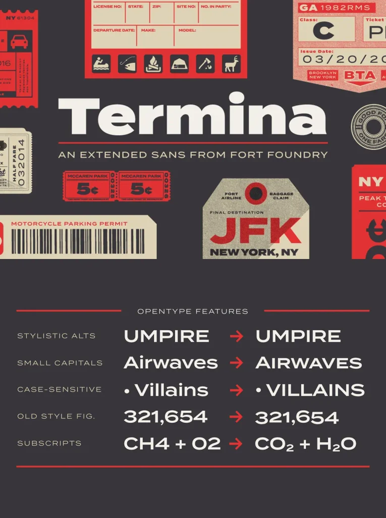
OpenType Features
Stylistic Alternates
Small Capitals
Old Style Figures
Case-Sensitive Forms
and more