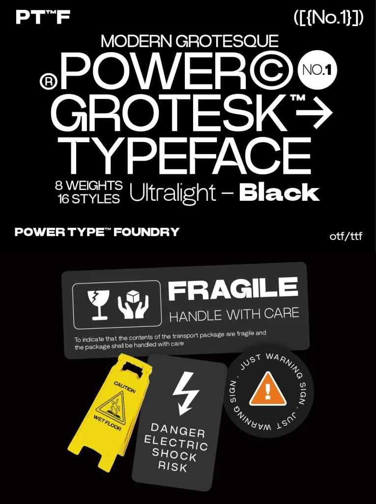
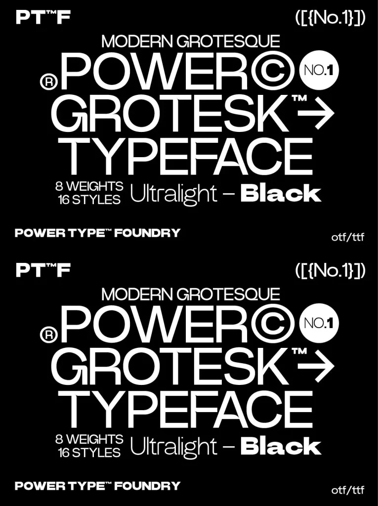
Power Grotesk: Geometric clarity with medieval roots
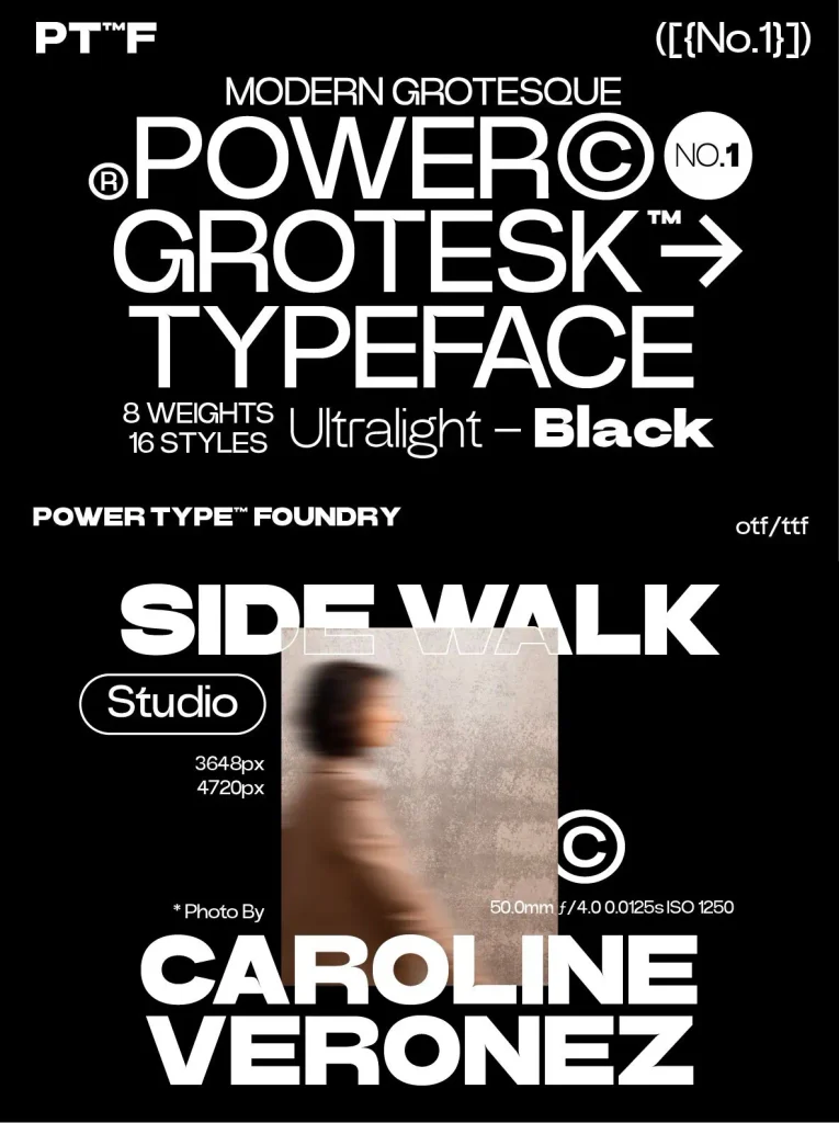
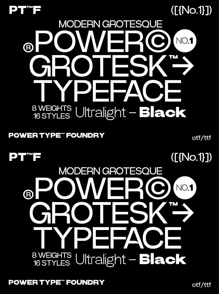
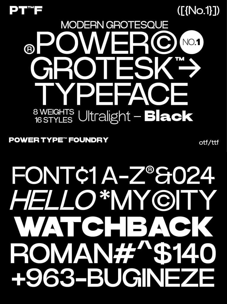
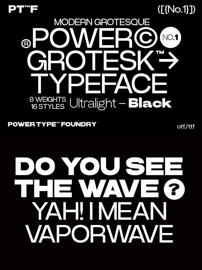
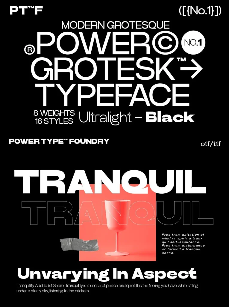
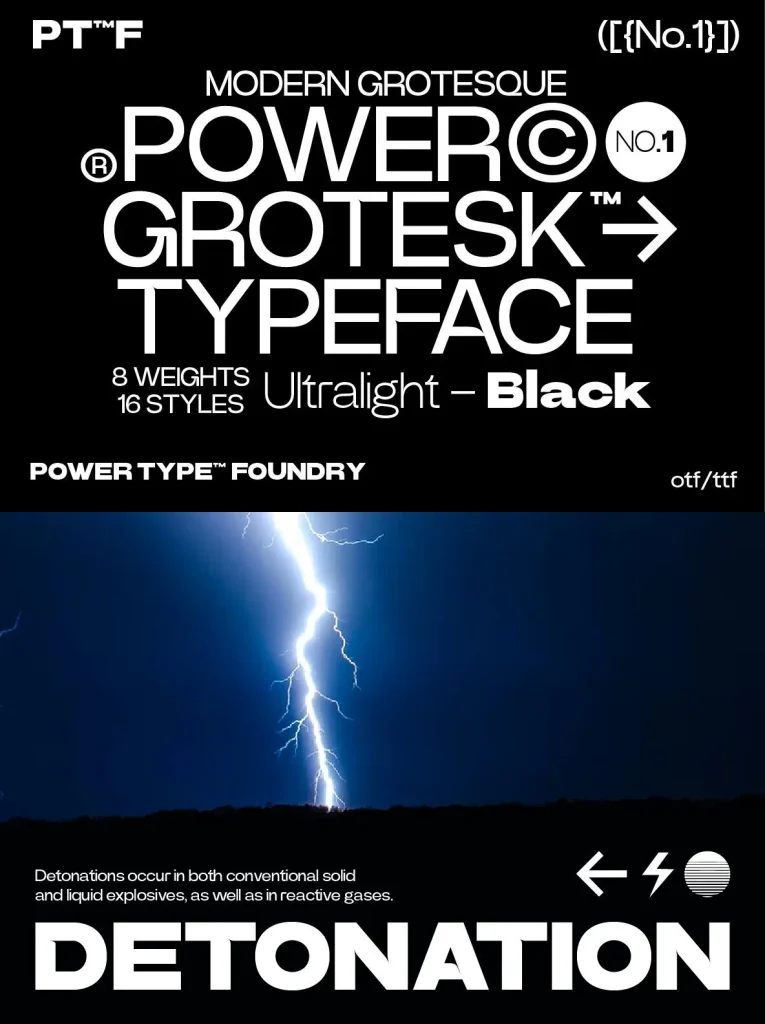
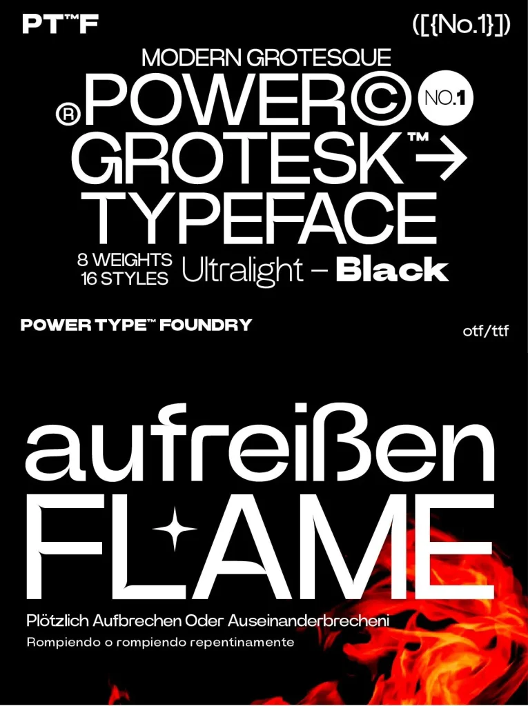
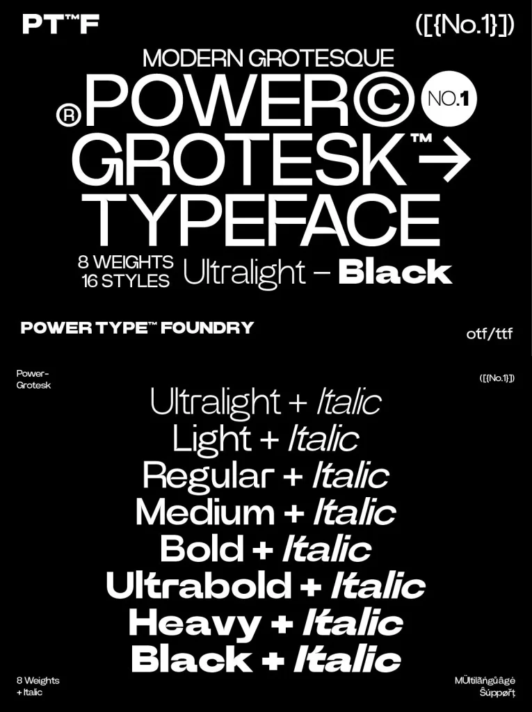
A sans serif typeface with distinctive details, built to keep its character from the thinnest to the thickest weights. The forms are slightly widened, helping typography read with confidence across a range of uses. It was drawn with legibility in mind, with strong contrast between black and white so it remains suitable at different sizes. A special feature supports reading and reproduction by trapping the right-sized ink, helping text hold together in print.
Geometric shapes and structures show clear inspiration from medieval typography. The design moves through the broad historical material that shaped modern typography, pairing contemporary details with classic styles. Power Grotesk is designed by Power Type Foundry and suits editorial typography, brand systems, and any setting that needs a sans serif with visible structure and reliable clarity.