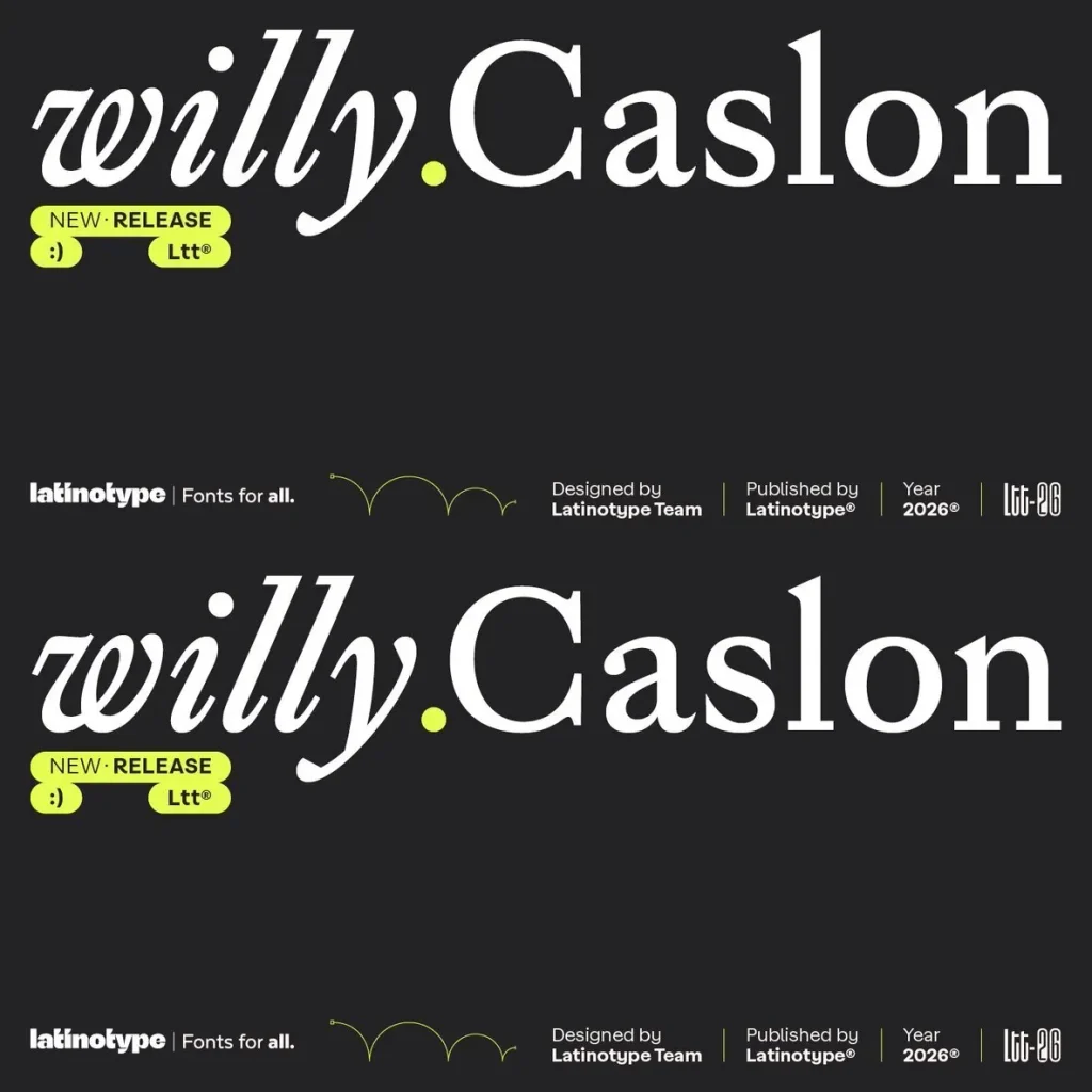
Willy Caslon — Classic Spirit, Fresh Stroke
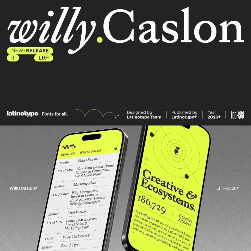
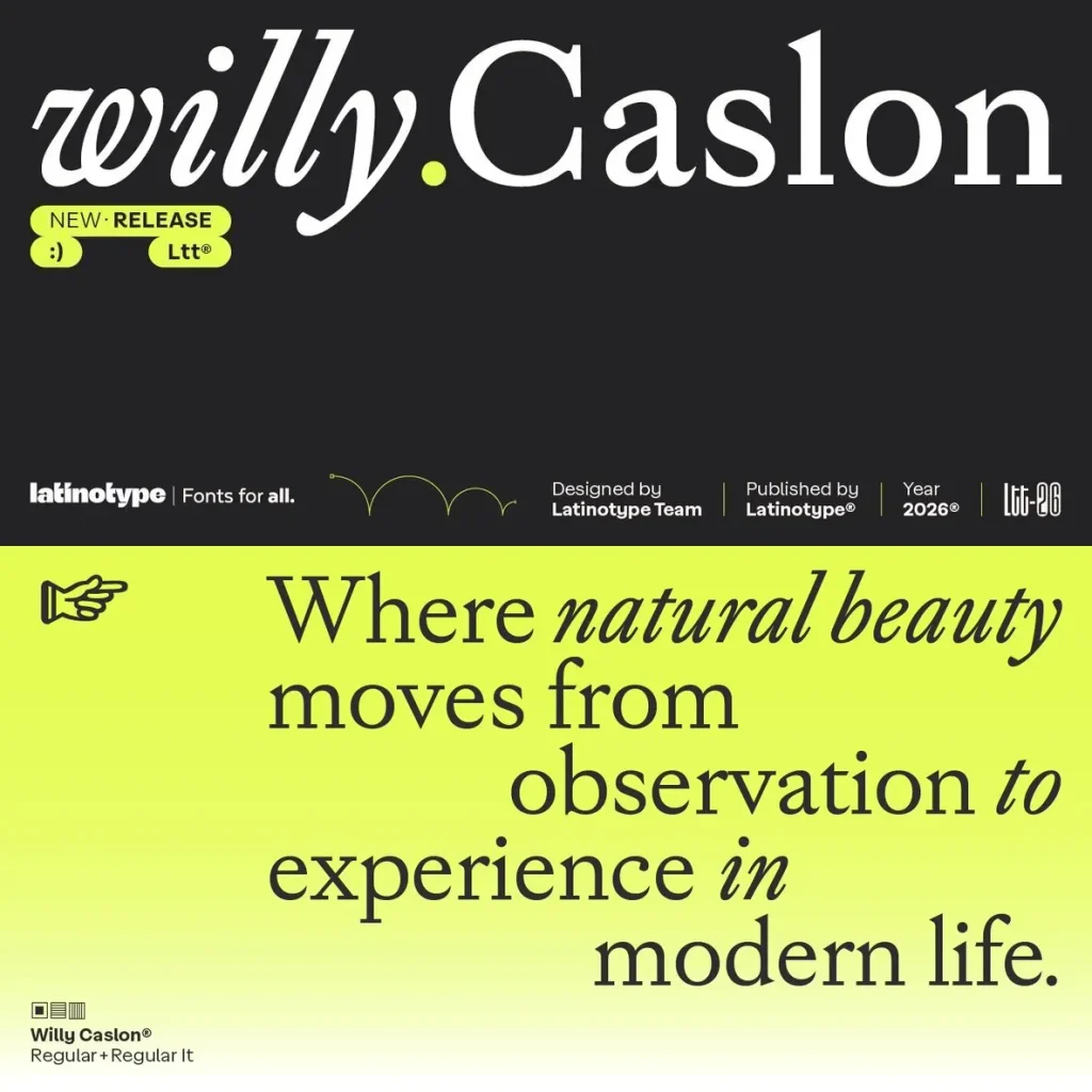
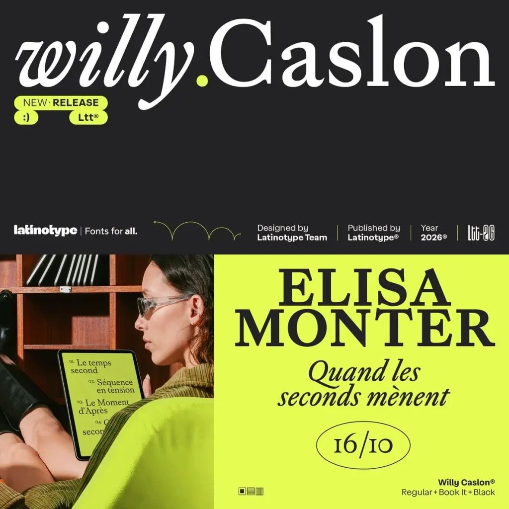
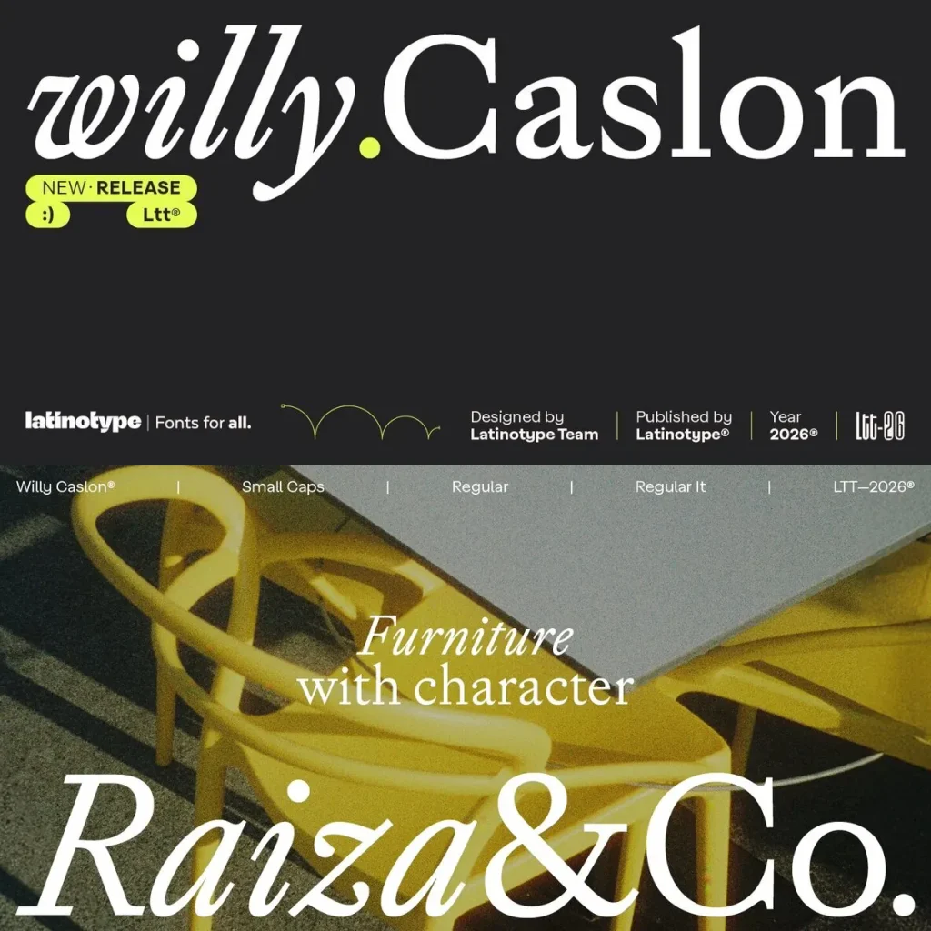
Willy Caslon is a contemporary serif typeface that reinterprets the English tradition associated with William Caslon for modern reading rhythms. The design sets the historical legacy of transitional roman typefaces in conversation with Latinotype’s editorial vision, giving the family a clear place in refined typography for print and digital use.
The typeface begins with moderate modulation and a slightly slanted axis, both rooted in classic Caslon forms. It then applies greater formal control to sharpen and refresh its structure. Sharp terminals define the serifs and appear clearly in letters such as a, c, and r. The curves narrow and concentrate, especially in the counters of the a and g and in the shoulder of the n, creating a more active rhythm in text.
Contrast becomes stronger at the stroke endings, giving Willy Caslon typographic presence without reducing readability. Its proportions support editorial settings, with a balanced x-height and consistent ascender-descender relationships. The italic has its own construction, while the uppercase letters integrate with the system through consistent weight and typographic color. Built for editorial identities, digital projects, and content-led applications, Willy Caslon remains fresh in its stroke and classic in its spirit.